Appearance
Scale images & Lazy loading
The Scale images & Lazy loading feature in Optimole enables you to enhance your website's performance by dynamically sizing images based on your visitor's screen using JavaScript. Through the lazy load functionality, Optimole ensures that these images will load and become visible only as you scroll down to the section where they are positioned on the page.
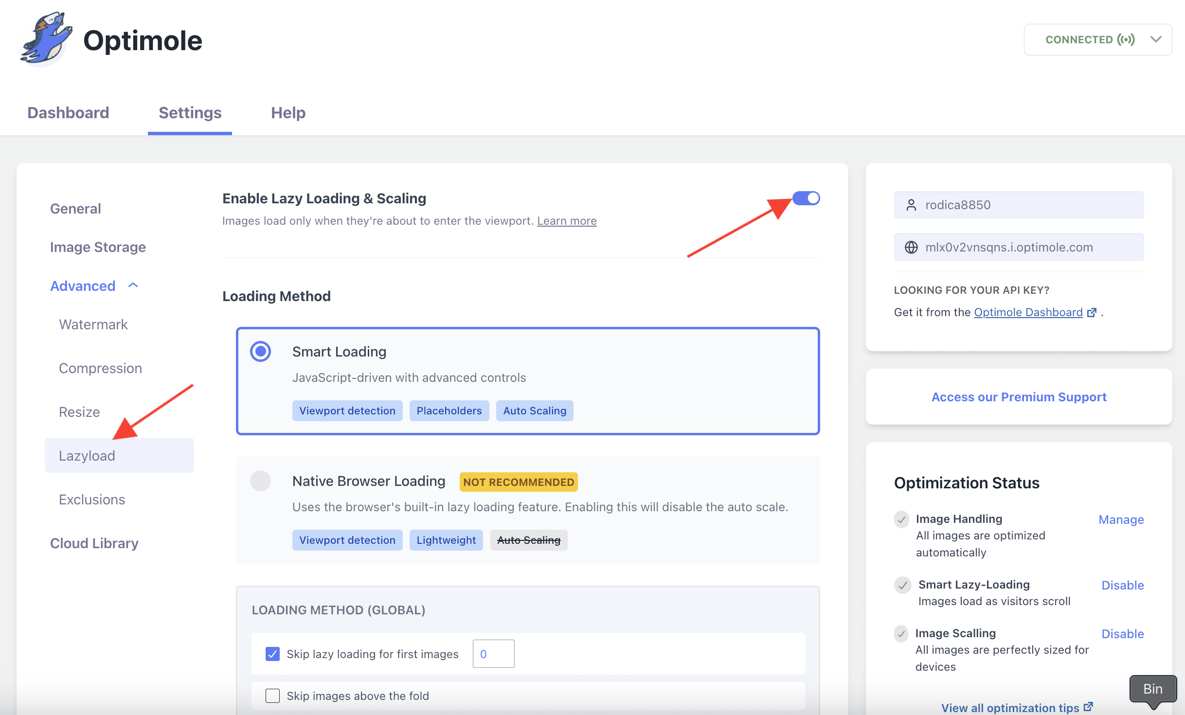
🔌 Enable the Feature
To enable this feature, navigate to WP Dashboard > Optimole.
1. Open the Settings tab.
2. Click on the Advanced > Lazyload panel from the left sidebar.
3. Use the toggle to enable Lazy Loading & Scaling feature.
🚀 User Site and Image Impact
Typically, when you visit a webpage, all the images load simultaneously, consuming time and data. However, with the "lazyload" feature, images are loaded only as you scroll down to the specific section where they are located on the page.
This Optimole's feature serves a dual purpose: it implements "lazy loading", rendering images to load only when they are visible, and it resizes these images to fit your screen optimally. In practical terms, suppose an image in your content is originally 1900x2000 pixels but appears on a browser at a smaller size, say 190x200 pixels. You can check the example below.
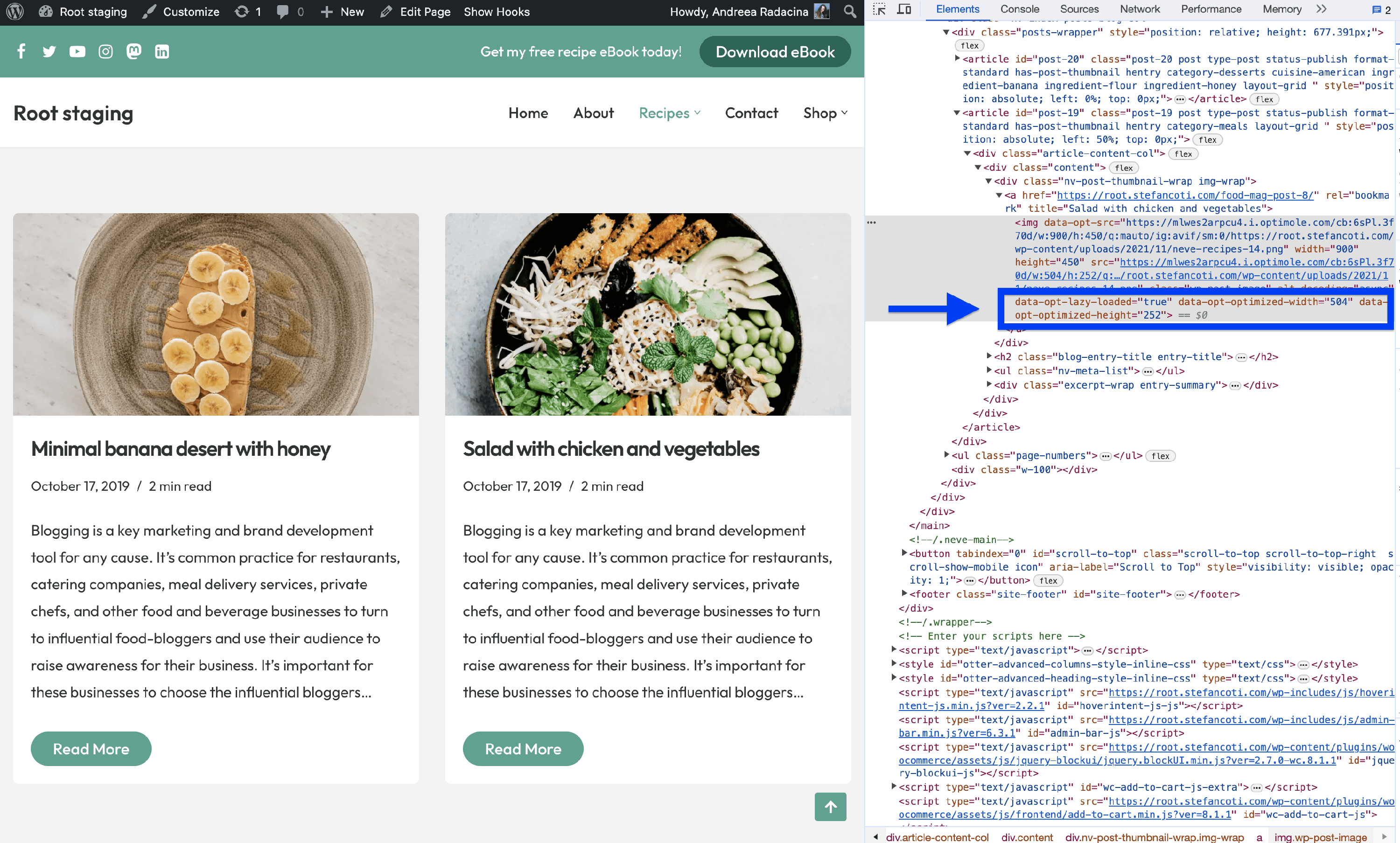
Image Parameters on Desktop
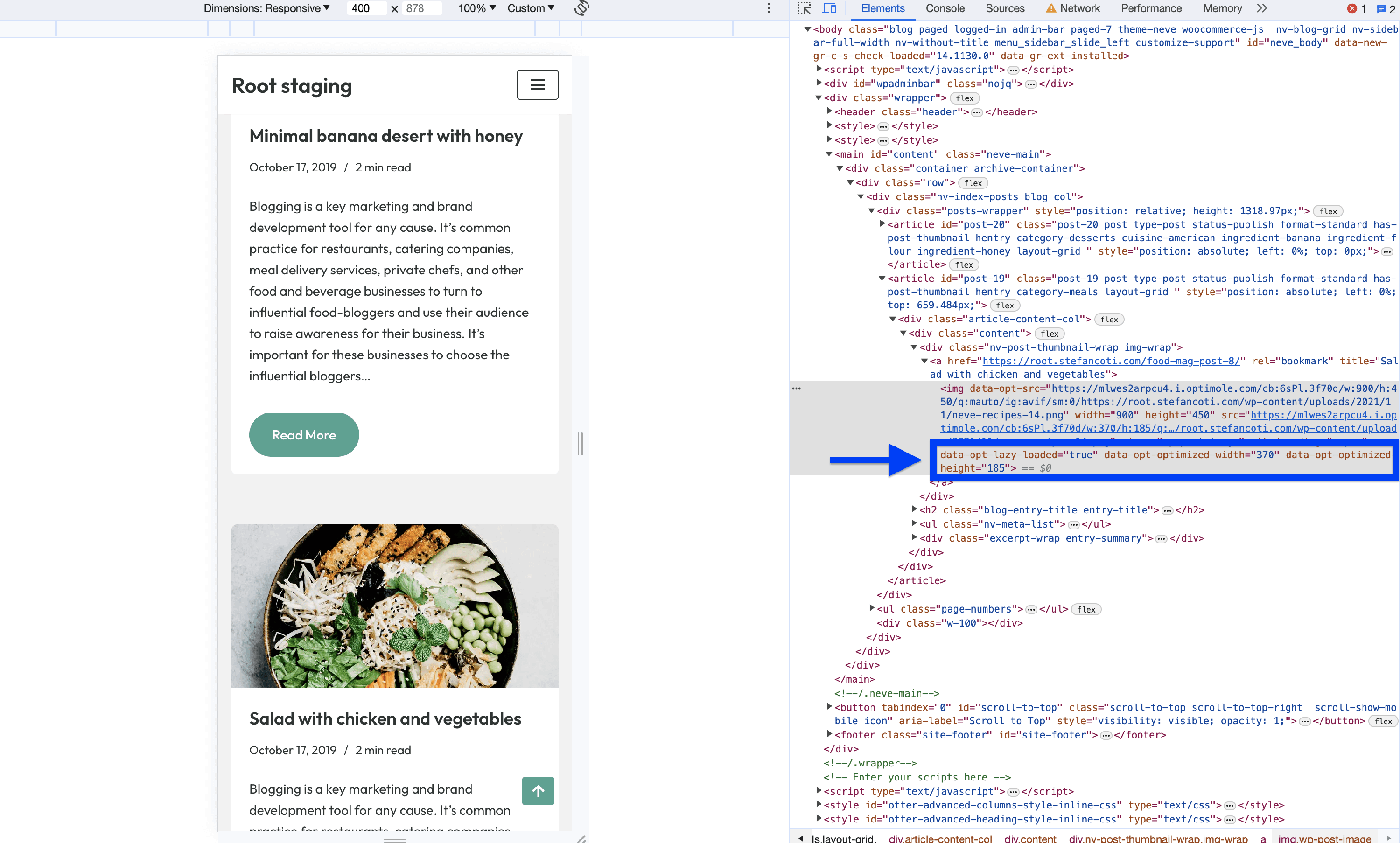
Image Parameters on Mobile
🔄 Benefits and Trade-offs
Benefits
- Search Engine Optimization (SEO) Benefits - Google considers website speed as a ranking factor. With Optimole, your website's improved loading speed can positively impact your SEO rankings.
- Bandwidth Savings - Optimole saves your bandwidth. It optimizes images as they're sent, using less data from your server to your visitors. This not only speeds up your site but also cuts hosting costs, especially if you pay for data usage.
- Improved Page Loading Speed - Optimole speeds up your website. It tailors image sizes for each visitor's screen using JavaScript, making your site load much faster.
Trade-offs
- Oversized Images - with this scaling turned off that 2000x3000 pixels image will appear much larger than the 200x300 pixels display box. This could lead to a messy layout and require users to scroll to see the entire image.
- Increased Data and Bandwidth Use - when images load at their full size, they consume more data, which might be an issue for users on limited data plans.
- Slower Page Load - larger images take longer to load, especially on slower connections or older devices, which could impact user experience.
🧩 Use Cases
This feature can be very advantageous for multiple use cases. Whether you run an e-commerce store, a blog, or a portfolio website, this feature ensures that your images are delivered efficiently, regardless of the device or screen size. Realize the potential of faster loading times in reducing bounce rates and increasing user engagement.
⚙️ Related Settings
🗂Useful Resources
You may find useful these guides:
- What is the Difference Between Lazy Loading vs Eager Loading?
- Lazy Loading Images: Complete Guide Plus 3 Ways to Implement It
- How to Add Lazy Loading Animations For Images?
Still looking for an answer? Contact us!